Natural Blog Review
This is the last review of 2011! Roll on 2012 where I have more reviews lined up for you all 🙂
Here is your free website review from The Website Doctor

http://sid-natural.blogspot.com/
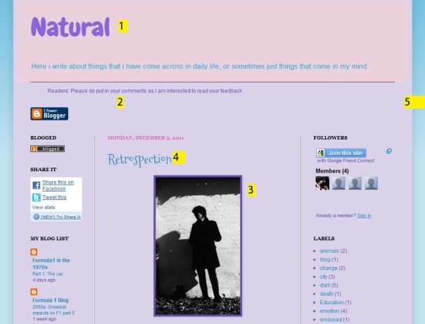
1: Centre the title. Makes it look better in my opinion.
2: This was meant to be aimed at your slogan, but the number moved :O Anyway, make each ‘i’ that is on its own a captial, so it would be ‘Here I write about things that I have ….’
3: Good size picture, although it is a little long. I can’t see any text on the landing view.
4: This font is a little bit childish to me, but if you like it, then stick with it.
5: Blue and pink? No. Not for me anyway. I think you need to put a bolder colour in there somewhere, because it looks quite faded at the moment.

6: This is possibly the most blunt question I have seen. It’s not really exciting. Think about it this way. Which of the following are you most likely to vote on?
– Was the design of my blog good easy enough for you to navigate it?
or
– Did you like the design?
The first question is much more detailed and asks you to base your vote on a certain part, where as the person might have not liked the coloured, but liked the font, so is unlikely to vote.

7: AHH! Not the Live Traffic Feed again! I absolutely hate this widget. I don’t like it displaying where I come from, then publishing it to the world. It’s like its invading my privacy. I know it is fun for the blog owner to see where their traffic is coming from, but the novelty soon wears off. Get rid of it.
8: A lot of your photos have a copyright water mark on. It makes these pictures look ugly and horrid. Try and use pictures that don’t have a dodgy watermark.
9: Lastly, Make this widget longer so there is no scroll bar on the right. It makes it easier to read and more user friendly.
🙂
Day 25 It’s Christmas!!!!
Merry Christmas!

You can now get a free gift if you own an iPod touch or iPhone. Download this app and receive a free app, video, song or book for 12 days, starting tomorrow!
We hope you enjoyed the Christmas countdown. Be back next year for the second countdown!
Day 24 Christmas Countdown
It‘s Christmas Eve!

Lets celebrate by tracking Santa on his flight through the world (or entertain your kids with it!)
Track him here
Soul Blind Ministry Blog Review
Here is your free website review from The Website Doctor!

1: Change the background. Use a different image that is not readily available on blogger. It’s okay to use a solid or gradient colour when another website has it, but if it is a fancy image, then it should be unique, and in my opinion, no other websites should use it. So search Google (or draw up a background yourself) that new bloggers will not easily be able to pick as the background. This is the same background as one of the blogs I reviewed a few months ago.
2: This title is okay but….
3:…this is also the title. It would be good if you could move this picture banner to the top and remove the single black title. It would make less like the template, and more unique.
4&5: I like the way you have videos on one column, and content on the other. If you don’t already, I’d put a new video each week, and update the content section twice a week. (If you made that video, what software did you use?)
6: I would take that voting thing off. Anyone can vote on it (I think) so you will get spammers and ‘funny people’ who will vote all of your posts as 1 start. Not good.
7: This isn’t very clear on the screen shot, but this is suppose to be able the snow. I like it! It’s not so much snow that it annoys you, and its not too little that we cant see it. Good!
8: This picture is rather big. It fills up the whole landing view when I visited this page. This means you have to scroll down to get to the text. Make the image smaller so it fills up just about half of the page, so we can immediately see some text too.
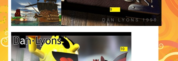
9: Again, watch the image size. This image is so big it goes over the edge of the white column.
10: This picture is okay width wide, but the length is too long. You should make it smaller so the whole image fits on the screen. It means we don’t have to adjust the screen to view it.
Errm, how many URLs does your blog have? You have a .com url there, so I would make sure you use that one all the time because it is the most professional.
🙂
Day 22 Christmas Countdown
Remember the film ‘The Snowman’?
Well here is a good quality version for you to watch!
Day 21 Christmas Countdown
Whoops! Didn’t realise I had two Day 21 posts! Well, you lucky people, you now get TWO things today! (Think of it as you forgetting to open an advent window, then getting two the next day!)
Anyway, here goes:
Wow, nearly there!

How about using a christmas twitter button? Use an image similar to the one above, and link it to your Twitter profile (On the twitter home page, click profile, then copy that URL). Makes a good replacement for those who don’t want to display their latest tweets on their blog!
Day 21 Christmas Countdown
Only three days!
For any pianists out there. Includes sheet music for free.
Day 20 Christmas Countdown
Hold on! Only 4 days left, and you haven’t brought someone a present! What are you going to do?!?!
Visit this website of course!


